
Improving the app experience for travelers in Sthlm
SL (Storstockholms Lokaltrafik) is responsible for public transportation in Stockholm. Always being on the lookout for things around me that I believe can be improved, I was curious as to how I could do just that with their phone app.
Update mid-2020: SL has done a redesign and the app now looks completely different.
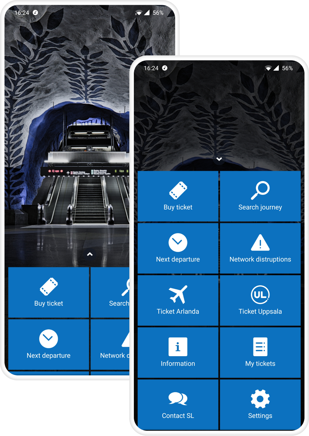
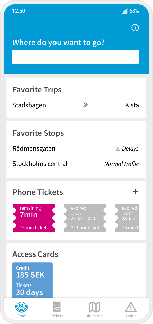
The main page of the current (former) app from SL
To find out what the real issues with the current app were, I tested it on five users.
I wanted to find out the users' pain points as well as have something to compare my finished redesign against.
Some of the findings include:
I continued with user interviews, I wanted to find out what they thought of the current app, what they found lacking and what they would wish for in a new app.
I interviewed three people of different ages and travel patterns. It was a quick and easy way to evaluate the current app and get ideas for a new main page.
Questions like:
The most important to users seemed to be able to access a trip planner, see traffic status and buy tickets.
None of the users I interviewed use the official SL app but rather a third-party app. The reason for this is they mainly use the trip planner and it is more user friendly in these other apps.
Taking the needs of these users into account, it was easy for me to create some initial sketches.
Present more information right on the start page in contrast with the current app that just shows a photo with shortcuts to other pages.
Quick access to the trip planner and your tickets. The navigation between pages is placed on the bottom to easily work on the mammoth phones of today.

To be able to test my ideas I created an interactive wireframe prototype in Figma.
I needed to test any assumptions I had made in the design and catch any unforeseen usability issues.
The four users were a mix of age, gender and usage patterns.
All users had some issues finding more information, or help, in the overflow menu on the top right. So for the next version, I changed the icon to an information “i” icon.
Some criteria while designing:
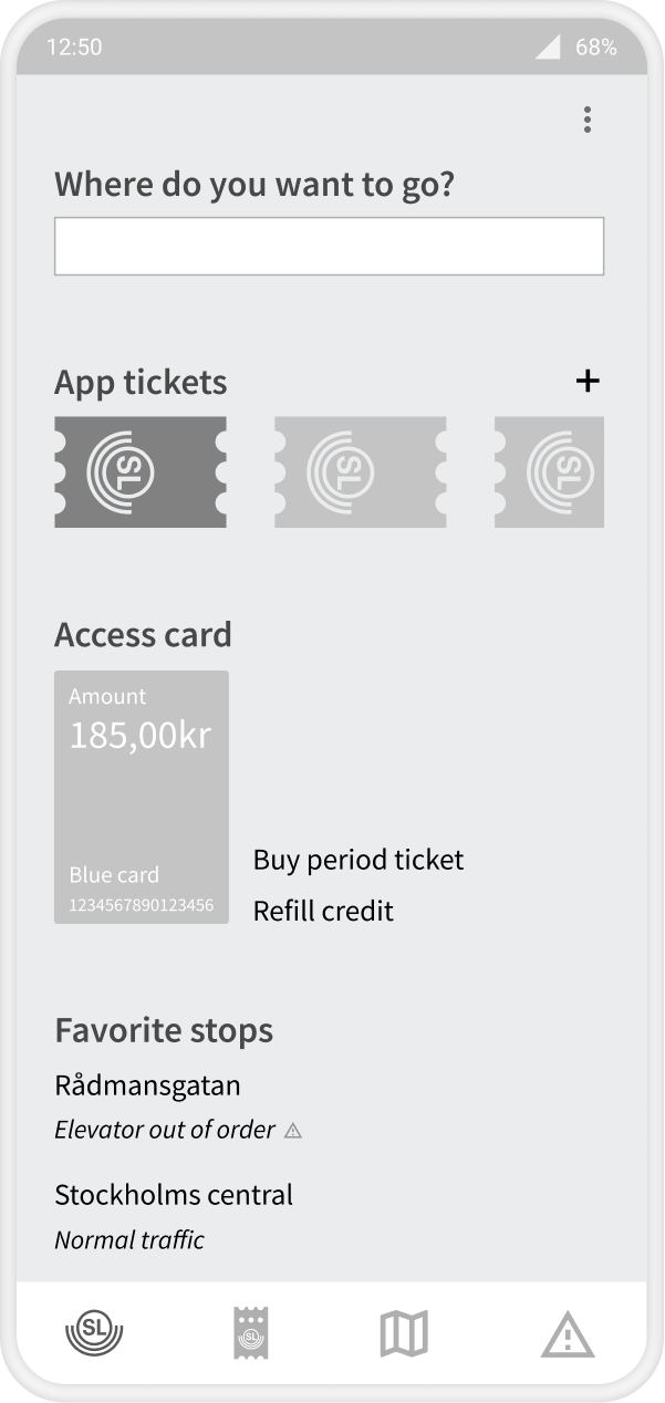
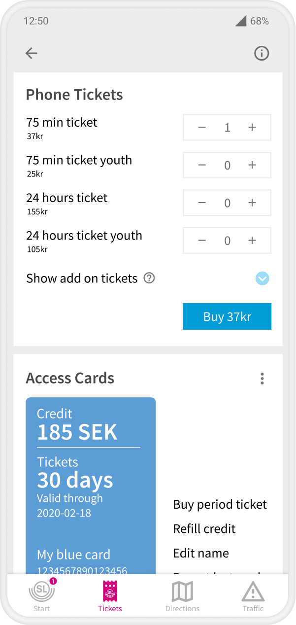
SL has a pretty elaborate ticket system: you can have tickets on the phone or a plastic RFID card called the Access card, but only a couple of all available tickets are available in the app, the rest must be put on the card at an ATM or service desk. You can, however, also buy tickets for your Access card on sl.se...
So this made me want to create an easy overview of all your different available tickets, right on the main page of the app.
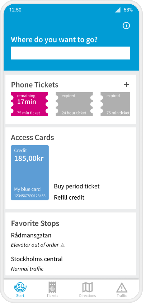
The tested prototype
Using my updated prototype, I wanted to test if it fulfilled the user needs I uncovered at the beginning of the process:
.png)
I didn't add any new functionality to the current app, with exception of accessing and managing the Access card. This is currently possible on their website though, so it shouldn't be that hard to implement technically.
Testing your assumptions is paramount, like me putting the information link in an overflow menu behind an overflow menu icon. This would be the first place and icon I would look for to get help, but only one of my testers went there.
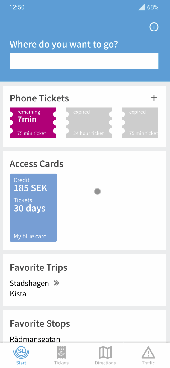
In my last design, I switched places of the travel planner with the tickets since in interviews and testing I found the travel planner to be the most important and most often used function of the app.
The focus of this project was the main page. Going forward I would go deeper into the design of the other pages of the app, global actions, navigation and flows.